Easy Way to Plot in Three Dimensions
An easy introduction to 3D plotting with Matplotlib
Want to be inspired? Come join my Super Quotes newsletter. 😎
Every Data Scientist should know how to create effective data visualisations. Without visualisation, you'll be stuck trying to crunch numbers and imagine thousands of data points in your head!
Beyond that, it's also a crucial tool for communicating effectively with non-technical business stake holders who'll more easily understand your results with a picture rather than just words.
Most of the data visualisation tutorials out there show the same basic things: scatter plots, line plots, box plots, bar charts, and heat maps. These are all fantastic for gaining quick, high-level insight into a dataset.
But what if we took things a step further. A 2D plot can only show the relationships between a single pair of axes x-y; a 3D plot on the other hand allows us to explore relationships of 3 pairs of axes: x-y, x-z, and y-z.
In this article, I'll give you an easy introduction into the world of 3D data visualisation using Matplotlib. At the end of it all, you'll be able to add 3D plotting to your Data Science tool kit!
Just before we jump in, check out the AI Smart Newsletter to read the latest and greatest on AI, Machine Learning, and Data Science!
3D Scatter and Line Plots
3D plotting in Matplotlib starts by enabling the utility toolkit. We can enable this toolkit by importing the mplot3d library, which comes with your standard Matplotlib installation via pip. Just be sure that your Matplotlib version is over 1.0.
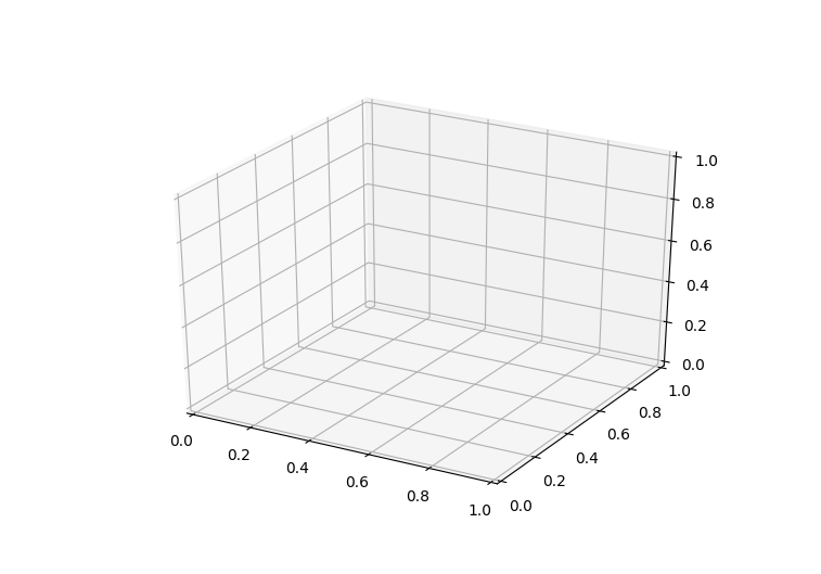
Once this sub-module is imported, 3D plots can be created by passing the keyword projection="3d" to any of the regular axes creation functions in Matplotlib:
                      from            mpl_toolkits            import            mplot3d              import              numpy              as              np
              import              matplotlib.pyplot              as              plt            fig = plt.figure()
ax = plt.axes(projection="3d")            plt.show()
Now that our axes are created we can start plotting in 3D. The 3D plotting functions are quite intuitive: instead of just scatter we call scatter3D , and instead of passing only x and y data, we pass over x, y, and z. All of the other function settings such as colour and line type remain the same as with the 2D plotting functions.
Here's an example of plotting a 3D line and 3D points.
          fig = plt.figure()
ax = plt.axes(projection="3d")z_line = np.linspace(0, 15, 1000)
x_line = np.cos(z_line)
y_line = np.sin(z_line)
ax.plot3D(x_line, y_line, z_line, 'gray')            z_points = 15 * np.random.random(100)
x_points = np.cos(z_points) + 0.1 * np.random.randn(100)
y_points = np.sin(z_points) + 0.1 * np.random.randn(100)
ax.scatter3D(x_points, y_points, z_points, c=z_points, cmap='hsv');            plt.show()
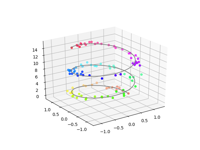
Here's the most awesome part about plotting in 3D: interactivity. The interactivity of plots becomes extremely useful for exploring your visualised data once you've plotted in 3D. Check out some of the different views I created by doing a simple click-and-drag of the plot!
Surface Plots
Surface plots can be great for visualising the relationships among 3 variables across the entire 3D landscape. They give a full structure and view as to how the value of each variable changes across the axes of the 2 others.
Constructing a surface plot in Matplotlib is a 3-step process.
(1) First we need to generate the actual points that will make up the surface plot. Now, generating all the points of the 3D surface is impossible since there are an infinite number of them! So instead, we'll generate just enough to be able to estimate the surface and then extrapolate the rest of the points. We'll define the x and y points and then compute the z points using a function.
fig = plt.figure()
ax = plt.axes(projection="3d") def z_function(x, y):
return np.sin(np.sqrt(x ** 2 + y ** 2))x = np.linspace(-6, 6, 30)
y = np.linspace(-6, 6, 30)X, Y = np.meshgrid(x, y)
Z = z_function(X, Y)
(2) The second step is to plot a wire-frame — this is our estimate of the surface.
          fig = plt.figure()
ax = plt.axes(projection="3d")          ax.plot_wireframe(X, Y, Z, color='green')
ax.set_xlabel('x')
ax.set_ylabel('y')
ax.set_zlabel('z')plt.show()
(3) Finally, we'll project our surface onto our wire-frame estimate and extrapolate all of the points.
          ax = plt.axes(projection='3d')
ax.plot_surface(X, Y, Z, rstride=1, cstride=1,
            cmap='winter', edgecolor='none')
ax.set_title('surface');
Beauty! There's our colourful 3D surface!
3D Bar Plots
Bar plots are used quite frequently in data visualisation projects since they're able to convey information, usually some type of comparison, in a simple and intuitive way. The beauty of 3D bar plots is that they maintain the simplicity of 2D bar plots while extending their capacity to represent comparative information.
Each bar in a bar plot always needs 2 things: a position and a size. With 3D bar plots, we're going to supply that information for all three variables x, y, z.
We'll select the z axis to encode the height of each bar; therefore, each bar will start at z = 0 and have a size that is proportional to the value we are trying to visualise. The x and y positions will represent the coordinates of the bar across the 2D plane of z = 0. We'll set the x and y size of each bar to a value of 1 so that all the bars have the same shape.
Check out the code and 3D plots below for an example!
          fig = plt.figure()
ax = plt.axes(projection="3d")num_bars = 15
x_pos = random.sample(xrange(20), num_bars)
y_pos = random.sample(xrange(20), num_bars)
z_pos = [0] * num_bars
x_size = np.ones(num_bars)
y_size = np.ones(num_bars)
z_size = random.sample(xrange(20), num_bars)            ax.bar3d(x_pos, y_pos, z_pos, x_size, y_size, z_size, color='aqua')
plt.show()
Source: https://towardsdatascience.com/an-easy-introduction-to-3d-plotting-with-matplotlib-801561999725
0 Response to "Easy Way to Plot in Three Dimensions"
Post a Comment